It’s the post we’ve all been waiting for! Ladies and gentlement, I give you, one creative use for your old tractor…
Filed under: music | Tagged: Music, Tractor | Leave a comment »
It’s the post we’ve all been waiting for! Ladies and gentlement, I give you, one creative use for your old tractor…
Filed under: music | Tagged: Music, Tractor | Leave a comment »
The label’s masterpiece? Love’s third album, 1967’s Forever Changes.
Elektra records is celebrating its 60th birthday this year, and as far as independently-minded, hugely successful labels are concerned, it’s managed to surf atop six decades of musical mayhem with great aplomb, maintaining a textbook mix of art and commerce — from Love and the Doors, through the Stooges, MC5 and New York Dolls, to Charlotte Gainsbourg, Björk and Cee-Lo Green.
Filed under: Advertising, Art, Cover art, Design, Inspiration, Internet, music | Tagged: Elektra, Fred Neil, Jac Holzman, Love, MC5, Music, Stooges, Tim Buckley, William S Harvey | Leave a comment »
“Sleeves were designed originally to serve as a protective device for records and labels during shipment. In the case of “45” rpm records, however, a device of this nature becomes unnecessary. The raised label area on 45’s fully prevents any harmful contact between the grooved surfaces of records during shipment. Paper separators – such as this sheet – are designed to protect record labels during shipment. They have no other useful function and may be discarded at your convenience…”
Sage record care advice from the folks at RCA Victor, circa 1952.
As you can see from the small selection of 45 sleeves shown above, thankfully, the rest of the music industry — and, indeed, RCA itself — didn’t share this rather quite touching faith in the durability of the company’s new vinyl medium, and quickly turned the humble shipping protector into an art form in its own right.
RCA’s numpty claim is very redolent of those made on behalf of the CD when it was first introduced — most famously on a 1981 episode of the popular TV science show, Tomorrow’s World, wherein the presenters happily smeared a shiny biscuit with jam, then wiped it off and played it, as if proving that it was virtually indestructible! And we know how that ended…
Filed under: Art, Cover art, Design, Fonts, Illustration, Inspiration, Package Design, Type | Tagged: Music, records, sleeves, vinyl | Leave a comment »
With the large-scale pomp of the WWF, it’s easy to forget that wrestling (like football) used to be a resolutely down-at-heel kids-to-grannies spectacle that was one toe-hold away from the carnival. Whether it was Kent Walton intoning “Greetings, grapple fans…” on ITV’s World of Sport, ushering in such unforgettable characters as Kendo Nagasaki, or Jerry ‘The King’ Lawler (who taught Andy Kaufman to wrestle!) broadcasting live from a church hall in West Memphis, thrills aplenty were to be had.
Filed under: Art, Books, Cover art, Design | Tagged: Memphis, Music, Simon Garfield, wrestling | Leave a comment »
In this age of digital derring-do, it’s easy for bands to put together great-looking gig flyers, posters and artwork for their releases. However, sometimes, there’s no substitute for extreme hand-lettering and illustration. With the prices of original 1960s rock posters by such artists as Rick Griffin, Stanley Mouse and Wes Wilson still rising in value (especially since the publication of The Art of Rock), and modern works by the likes of Coop and Kozik attracting serious attention (they’re documented in Art of Modern Rock), it’s time to praise the UK’s greatest current poster artist, Ski Williams.
Filed under: Advertising, Art, Cover art, Design, Illustration | Tagged: blues, Graphics, hand lettering, Music, posters, rock'n'roll | 1 Comment »
Stunning Smuin Ballet Company Poster campaign by Evolution Bureau, USA
Filed under: Advertising, Design, Inspiration, Magazines | Tagged: Advertising, Beautiful, Design, innovation, Inspiration, Magazines, Music | Leave a comment »
Among other good stuff, Give Up Art are behind the excellent branding, flyers and album artwork for influential radio station Rinse FM and their club night, FWD.
They also art directed the packaging for this album by Headhunter:


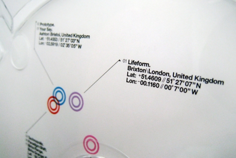
“For his debut album Headhunter had recorded each track in a different studio location around the globe – hence the title “Nomad”. Taking this as a starting point the bespoke cover typography references the contour lines found on maps. And inside the CD packaging also plots each of the tracks in relation to their latitude and longitude co-ordinates.
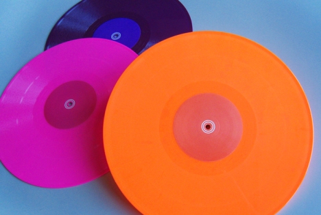
A series of three limited edition 12″ singles were also pressed up. Each featuring a bespoke die-cut sleeve, and pressed on super-bright fluorescent vinyl.”
Filed under: Design, Inspiration | Tagged: Music | 1 Comment »